QUESTIONS:
1. How can motion be included / change a collage composition?
2. What happens to the message when motion is added?
3. What kinds of motion can be combined with collage? (stop-motion, gif, motion graphic)
4. What if the layers of a collage are removed to change the message over time?
5. How does legibility (or the lack of) change the message / voice?
6. What kinds of distortion can be created digitally vs. handmade?
7. What is the main function of collage AND how can that be altered to break tradition?
8. How can there be multiple messages in once piece that changes for different viewers?
9. How do the methods of creation differ? (handmade / digital)
10. How have previous designers experimented with collage typography? (done already)
11. How could you break down pieces of classic typefaces in a distinguishable way?
12. How could you break down pieces of classes typefaces in an indistinguishable way?
13. How do layers play a part in the making / creation of collage typography?
QUESTIONS FOCUSED ON:
1. How can motion be included / change a collage composition?
11. How could you break down pieces of classic typefaces in a distinguishable / indistinguishable way?
NEW WORK: (round 1)
 LEARNED:
This form of collaging typefaces together has been done before. Not necessarily with Futura, Clarendon and Bodoni, but there have been two alphabets made that have had this same idea.
How do I keep with this idea but explore it in a new way?
LEARNED:
This form of collaging typefaces together has been done before. Not necessarily with Futura, Clarendon and Bodoni, but there have been two alphabets made that have had this same idea.
How do I keep with this idea but explore it in a new way?
NEW WORK: (round 2)
WHY BODONI / CLARENDON / FUTURA?
These three typefaces are classics and as designers they each have specific aspect about them that are distinguishable. I wanted to focus this round on the parts of each that can be determined from other typefaces and collage them together to see how distorted and interesting I could make them.
Cutting obvious pieces of each typeface to collage them together in multiple ways.
(original aligned / left aligned / center aligned / right aligned / random)
LEARNED:
If the pieces are uneven cuts you will start to see more of one typeface than another. This would be a more DISTINGUISHABLE way to collage typefaces together.
(even cuts made from each font (Bodoni / Clarendon / Futura)
LEARNED:
I thought the inverse color (white on black) was an interesting effect because of the different letters you begin to see just in the B alone.
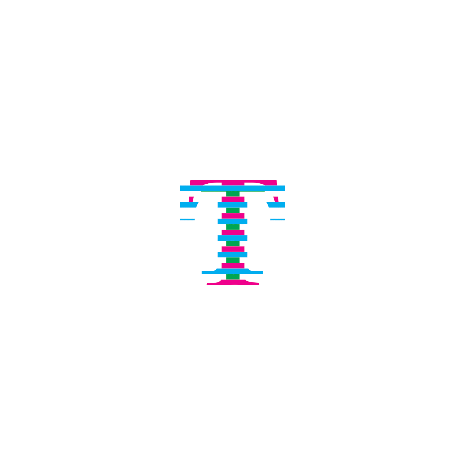
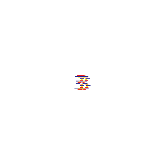
(even horizontal cuts made) (Bodoni = Pink / Clarendon = Blue / Futura = Green)
NEW WORK: (round 3) SETTING RULES
LEARNED:
Making an even grid to cut the letters and keeping things constant (setting rules) would reduce the chances of seeing one color more than another.
(setting rules) Futura = Yellow / Clarendon = Blue / Bodoni = Red
I changed the colors to primary colors to take this focus off of one of the typefaces)
Manually centered aligned / Left alignment tool / Center alignment tool
LEARNED:
I love the way the Center Alignment Tool letters look. Distorted enough to be interesting but still distinguishable enough to see the letters and the different pieces from Bodoni / Clarendon / and Futura.
WHAT WOULD THESE ALPHABET LOOK LIKE IN BLACK?
(creating words with the alphabet)
WHY STAY DIGITAL AFTER THIS POINT?
There is so much more than you can create digitally that you cannot by creating things by hand, I didn't want to just abandon digital collage completely and further explore the possibilities. I have always loved motion and creating motion graphics, so why not explore another question with the question of "collaging typefaces together" and see what comes from it.
NEW WORK: ADDING MOTION (the fun part)
THE START
COLLAGED ALPHABET
COLLAGED "TYPOGRAPHY"
ALL BLACK
ALL BLACK ALPHABET
MOST INTERESTING LETTERS (PERSONALLY)
CLOSE UP OF B
NEW WORK THE REALLY FUN STUFF: (round 4)
LEARNED:
There is still so much to be explored with motion and collage. I really like the idea of combining these two styles together to create something new and "experimental" (:
REFLECTION:
This first round (or 4) showed some interesting ideas and experiments. I'm happy with the outcome and the question I started with. I think there is tons more to be done with this idea and question, I do think that since I have categorized and set rules for THIS SPECIFIC WAY TO COLLAGE TYPEFACES that this way has been explored to it's fullest extent (besides creating compositions and "poster-esk" designs with this alphabet)
WHATS NEXT:
Im planning on staying with the motion aspect behind this question but moving into different ways to create motion and a new set of rules and experiments. Im going to move away from "collaging classic typefaces together" and move to how a message and voice can change when motion is added. I also really like the idea of time PHYSICALLY changing a collage and it's message.
2. What happens to the message when motion is added?
4. What happens if the layers of a collage are removed and changed over time to change the message?